Once again, these are acrylic paintings finished recently. Would like your opinion. All comments, good or not, are welcome not so good. Its all part of my learning curve, so feel free to say whatever, its ok.
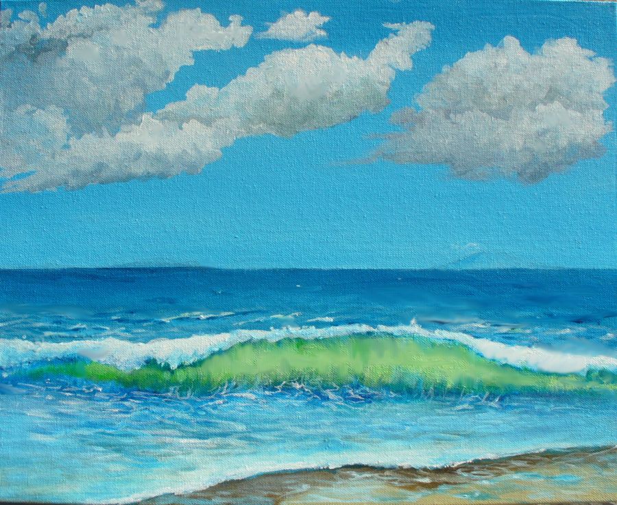
1. Seascape. The clouds in the ocean painting look much better in real life, they really look 3D because you can see the contrast. The cloud on the right for instance is clearly two clouds when viewed in person, one being behind the other. My photography was in strong light from the side, thus you are seeing all the little imperfections in the paint, should have been head on to avoid that distraction.
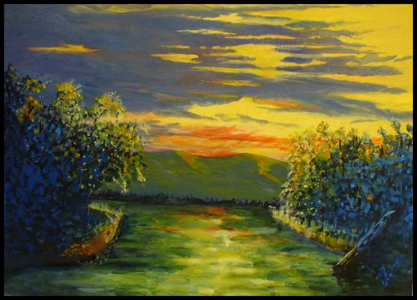
2. Surreal river. The bottom painting is an experiment in color. The shady parts are done in black and blue. The leaves look a little luminescent, which was intended. The water is, well, its being touched up today, not real happy with that part. Notice the old tree sunk in the water on the lower right? Its half in the light and half out. If you look deep, just below the mountains, you can see the edge of the tree line against the river.
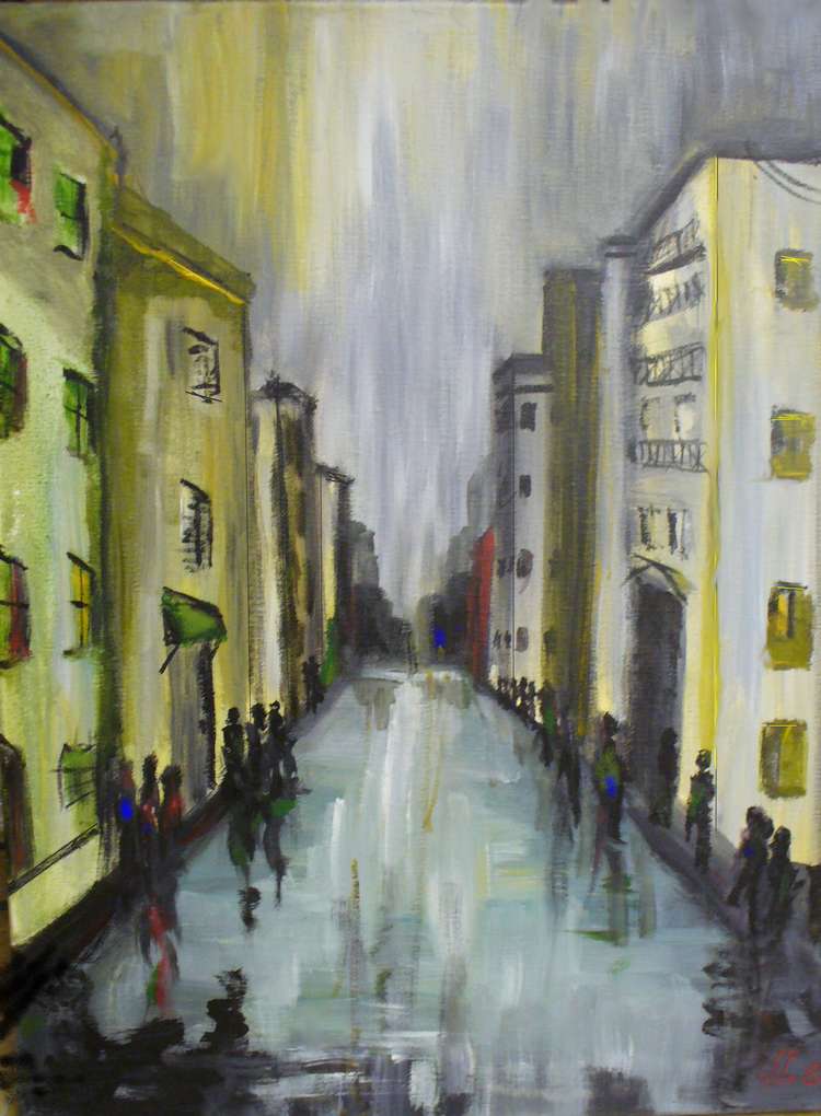
3. New Orleans. The bottom painting appeared in a thumbnail earlier, its an impressionist piece of New Orleans at night (Sold – private collection).
The street scene is my favorite. I enjoy landscapes but tend to prefer paintings with people or animals in them, or the suggestion of people or animals.
One of my favorite paintings that nods to Impressionism is a lithograph of a painting that hangs in a walk-in medical clinic here in Chico. The are no people or animals in it. Just a farm house in the background suggesting people and some matted down grass in the foreground suggesting where deer spent the night huddled together. Simple and beautiful with a magnificent eye for light and composition.
I prefer paintings that have a distinct asymmetry and invite the eye into the work. “New Orleans” has a subtle asymmetry where, to my eye, “Surreal River” does not. I think you should go back to work on “Surreal River” and break up the symmetry and add dashes of bright light colors to the oppressive blue in the foreground. Your mix of colors in the river and sky is really quite beautiful.
I understand your aim for verticality in the “New Orleans” sky but think it way overstated. To the point of distraction.
I am not a fan of seascapes unless the have a hint of human or animal activity.
Lastly, I am no artist nor art critic. I just know what I like. So you can take my comments with a grain of salt.
Pie, I value your comments more than you could know…and all were very helpful. Thanks.
You are kind to say so Jack, but you can’t go by me. I think Van Gogh is way overrated, Picasso just plain sucks, and Mondrian (whose Composition No. III, with Red, Blue, Yellow, and Black recently sold for $50.6 million) is godawful garbage.
Pie, if wanted to be an art forger, I think I would pick a Mondrian! Hey, put down some black lines and a few colored squares… how hard could it be? Well, the art world is a strange place and they really, really, really love something new. If nothing else, he was original in his day.
Pie has a good suggestion about the middle one, on the one painting of a wave breaking off the beach, The scene could be a bit more interesting if say a vague outline of a “Navy seal” or porpoise might be seen in the wave, maybe faintly under the wave curl center left.
The Shore line, if expanded would (I would not) hold more interest with a piece of driftwood on it, or the hull of a sunken Iranian patrol boat…. 🙂
I liked the top and bottom ones a lot….Good work….
Navy Seals, sunken Iranian patrol boat…I like it!