by Jack As always, your critical advise is most welcome. This is done in acrylic on canvas. I finished it Wed. This was an experiment in perspective. The scene is supposed to be an Italian village with homes dotting the hills in the background. The homes in the front are built behind a sea wall.
Thanks for any input… (feel free to be harsh, this is how I learn). 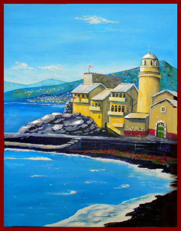
Very nice. Is your last name Rembrandt?
Thanks Bob…no, most of the time my last name is mud, not Rembrandt!
“This was an experiment in perspective.”
Very nice overall. Buildings in foreground look good…edge on slanted structure in foreground makes it float a bit or slant forward as if anchored on a hill.
Hills in the background could appear more at a distance (perspective) if the edges were softened slightly. The far hills recede well with the pale pastel color. The blue color with the green white and yellow dobs behind the far city distract the eye so that the little village isn’t recognized as such. I’d soften that out to give the village relevance. In fact it might work to make that forward hill a soft grey green blending to grey blue toward the summit. (??? something)
I think I would have made the tower just a bit higher to make it seem to reach into the sky. Also it appears to tilt slightly backward…anchor those buildings 😉 The roof on that center building next to the tower need to pull forward a bit if the windows are going to be darker that the ones in the buildings to the left of it. I’m a little confused by the greyed color of the little building in front of the tower which has a similar value to the walls in shadow. It’s roof line is slightly turned suggesting a different exposure but it shouldn’t match the walls definitely in shadow. Also the roof on the smallest building is the same bright yellow as the brightest buildings even though it slants downward (?).
Edge of waves beneath the flowers look good and suggest crashing against shore. Foreground water might need evidence that the water is moving…perhaps a parallel soft line where water “has been” on the shore? Wave in the distance is too stark, particularly at the edge…like an arrow it sends eye off the page instead of directing it into the painting.
I’m being very critical because I think you have talent.
I love the little flag and the flowers in the window boxes which suggest people actually reside there!
Thank you Tina, many of those things you have pointed out I also noticed. Really appreciate your help. I can make those modifications fairly easily too. You have a great eye!!! -Jack
Make sure the flag and waves more or less match wind direction. Also, green foliage tends to look increasingly darker with distance, even in bright sunlight. I agree with Tina about the hills. Might round them off a bit as well so they don’t look quite so “sawtooth”.
Thanks RHT…Yep, I agree, all good thoughts.
Your a renaissance man, Jack.
You can do anything except talk some since into the 3 amigos: Libby, Chris and Dewey.
>since
D’oh! I’ve lost my sense (and cents).