Just finished this landscape. Would appreciate any comments, good or bad. Thanks. Oh and it’s done in acrylic and is 30×24. You must click on the painting to see it in its regular shape, right now it looks squeezed.
The colors are more vivid in person now and I made some changes that Tina suggested. I think I like this period of painting, it’s based on 19th century landscapes (done in oil of course) but I can get pretty close with acrylics if I layer them to bring out the color. Up till now I have been using cheaper grades of paint because I am in a learning mode. I’ve learned what these 19th landscape masters did to make their paintings popular and pretty soon I think I will be off on my own style. Hopefully, everyone that bought my paintings in their early form will make lots of money from them when I’m gone! And I’m pretty old too, so it may not take long! lol -Jack
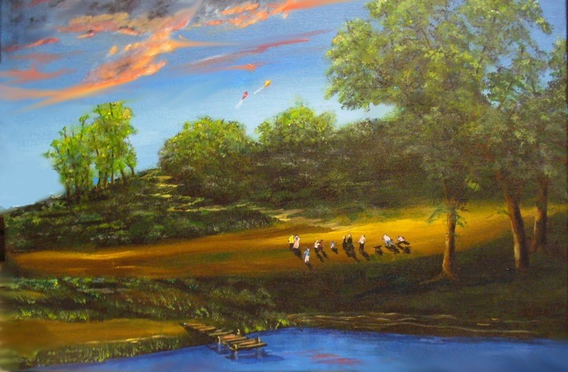
Beautiful cloud work! The trail is great because it leads the eye to the sky so that we can appreciate nature’s display. But the light on the trail might be a little too strong at the crest of the hill and maybe a little too uniformly zig zaggy because it takes center stage rather than acting like a gentle arrow.
The grasses near the dock also lead the eye off the page rather than into the painting…use this area to point toward the people and you’ve created that lovely meandering direction to your focal point. Which causes me to inquire…are those clouds or big kites just above the bushes on the hill? I realize it’s hard to tell on the computer…wouldn’t it be fun if they were kites?
Your work is improving, Jack.
Thank you Tina…yes, those are two kites above the trees, you can see them easier in the real painting. All your points are right on the money. I have to be aware to not form patterns when doing things like the path. Good tip. Just did a quick fix..better?
Lot’s better! What you did in the grass areas in the foreground and to the people (And the little dog!) really works! I love it!
I hate to be a stickler…the grayish tower (?) like shape between the foreground trees on the right and the hills in the background is a distraction. I keep wondering..is it part of the tree or is it something on the hill…if its on the hill what is it? Can you explain so I can sleep tonight? 😉
Okay, just took a look and I think you are referring to a tree that was covered in climbing vines and it had a canopy until the branches from the big tree covered it up. Maybe I should erase it?
Works for me! In fact, you’ve made the day sparkle!
Thanks Tina…then it was a painting worth doing.
Have you ever tried to sell your paintings?
It might be a good way to supplement your income but I guess being a famous blogger and everything you don’t need to.
I sure I wish I could paint like that.
But when I was a kid the teacher told me my paintings were very autistic. I said, “You mean artistic?” And she said no.
I don’t know Bill, you might have the expertise to produce something like this, but you might have to develop a problem with alcohol to achieve the proper effect. 😉