Almost everyone pays taxes, sales taxes and property taxes either directly or it’s included in rent.
However as I recall Thomas Jefferson felt that only property owners should vote. I wonder what a map like that would look like.
Good question, Jim. Particularly since the non-recovery has kept quite a number of people out of the home buying que.
Without a robust economy and good jobs the chances of young people becoming a new homeowner are pretty slim.
What a sad state of affairs.
I wish the radicals in the Dem Party could be replaced with more reasonable leaders. The meddling they’ve done in lending and at Fannie Mae, as well as their failed Fed QE policy, have done a great disservice to this country. The damage will be felt for years to come. If we don’t quickly set ourselves on a different course this condition will get much worse.
The way to get more minorities and poor whites into housing is by getting more of them into the middle class. That happens naturally if the economy is functioning unhindered by manipulative regulation. A robust economy that encourages entrepreneurial activity in black communities will provide good jobs. In addition the bad teachers and conditions in minority schools must be addressed so that more kids get a good foundation K-12 and then go on to trade schools or college. We need to clean up the streets and offer opportunity…that will make home ownership possible and it will be real, not the counterfeit offered by meddling. (The plan to lower lending standards was doomed from the beginning.)
During the Reagan years “Black-owned businesses saw income rise from $12.4 billion in 1982 to $18.1 billion in 1987-an annual average growth rate of 7.9 percent. The black middle class expanded by one-third during the Reagan years, from 3.6 million to 4.8 million.
Reagan was committed to business ownership. In 1982 he laid out his plan. He understood that government spending should be designed to make people become independent and self reliant rather than offering them a path to permanent dependency.
People can’t become homeowners if they don’t have good jobs in a thriving economy. Government creates conditions, either good or poor, the rest is up to us. It’s difficult for us to step up when government ties our hands and blunts our ambitions.
As per usual I have run off at the mouth. But it’s an important topic!
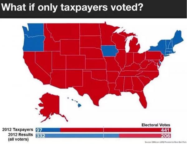
This is not a map showing “what if only taxpayers voted.” It is actually just a re-labeled map showing what would have happened in 2012 if only white people were able to vote.
As of July 8, 2014, the demographic breakdown of welfare recipients was 38.8 percent Caucasian, 39.8 percent African American, 15.7 percent Hispanic, 2.5 percent Asian and 3.3 percent Other. There are 12.8 million Americans on welfare, which is equivalent to 4.1 percent of the U.S. population.
Your evaluation of Zero Hedge is poppy cock. This map is not a “mistake.”
The map simply uses the last presidential election to illustrate how different the outcome would be if those living off the government (taxpayer) didn’t vote.
It’s a shocking difference. I think it illustrates the danger inherent in a system that encourages people toward dependency and away from self reliance. Of course they will vote for the person that promises them more goodies…who wouldn’t?
Liberalism (progressivism) is being discredited and that is why you don;t like it…Chris!
“The map simply uses the last presidential election to illustrate how different the outcome would be if those living off the government (taxpayer) didn’t vote.”
It did not. Again, the map is taken from a Buzzfeed article that calculated what the 2012 election would look like if only white people voted. There never was any calculation to see what would happen if only taxpayers voted; the map is simply lifted directly from the Buzzfeed article.
You don’t have to post this comment. I’m only trying to help you. You can just update the article and say the map is inaccurately labeled; I don’t have to have had anything to do with it.
The map does replicate the Buzzfeed map as you asserted. Durden equated it to the 2012 election and taxpayers…he also referenced the electoral college. I can’t say one way or another whether the map he used came from Buzzfeed. I will say if not it’s an unbelievable coinkydink.
The Buzzfeed map is a 1920 map (not 2012) with the following explanation:
While women’s suffrage passed in 1920, there were still huge impediments to minorities to vote during that period, for instance in the form of poll taxes (only finally outlawed by the 24th Amendment in 1964). So here’s a version of the map that shows only white voters, men and women.
Women finally got the right to vote in 1920 (Republicans 200-19 for, Democrats 102-69 for) but until 1980, according to Wikipedia, women didn’t vote in the same numbers as men. (Probably many of them didn’t concern themselves with politics) In 1900, according to PBS only 6% of women worked outside the home and then mostly when their husbands lost their jobs. Women were homemakers. Married women did begin to move into the labor force in 1920 but it wasn’t a deluge. Given this information it’s not far fetched to imagine that most of the voters in 1920 were tax paying white men.
I’ve read Zero hedge for some time. I don;t have any reason to think that generally speaking Tyler Durden would intentionally mislead, certainly no more than Buzzfeed would. Wikipedia:
BuzzFeed produces daily content, in which the work of staff reporters, contributors, syndicated cartoon artists, and its community are featured. Popular formats on the website include lists, videos, and quizzes. Whereas BuzzFeed was initially focused exclusively on such viral content, according to The New York Times, “it added more traditional content, building a track record for delivering breaking news and deeply reported articles” in the years up to 2014.[19] In that year, BuzzFeed deleted over 4000 early posts, “apparently because, as time passed, they looked stupider and stupider”, as observed by The New Yorker.[20]
But actually, the Buzzfeed article is confusing. The way I read it, it was a 2012 map, just calculated to what it would be like if suffrage were still what it was in 1920. That’s what the different years listed represent; so the “1850” map represents what 2012 would have looked like if only white men could vote (as was the case before 1870) and the 1920 map shows what 2012 would have been like if only whites (men and women) could vote. This doesn’t make a lot of sense to me, since blacks could vote since 1870, but Buzzfeed says they did it this way because poll taxes were still around. It all seems needlessly confusing, but that’s Buzzfeed for ya. I don’t blame you for the mistake since it took me a while to get it too.

Well that would be interesting.
It might encourage both Congress and the office of POTUS to treat the economy of the USA as a party priority.
A novel idea in certain circles, eh Harold?
Spot on.
This isn’t a free speech area.
From the link: “This would be a great presidential debate question.
Hillary Clinton, do you believe in free speech zones and safe spaces on college campuses?”
But we’d just get one of those long rambling say-nothing answers that begin with a five minute cackle and then, “Well, you know (moderator)…..”
Almost everyone pays taxes, sales taxes and property taxes either directly or it’s included in rent.
However as I recall Thomas Jefferson felt that only property owners should vote. I wonder what a map like that would look like.
Good question, Jim. Particularly since the non-recovery has kept quite a number of people out of the home buying que.
Without a robust economy and good jobs the chances of young people becoming a new homeowner are pretty slim.
What a sad state of affairs.
I wish the radicals in the Dem Party could be replaced with more reasonable leaders. The meddling they’ve done in lending and at Fannie Mae, as well as their failed Fed QE policy, have done a great disservice to this country. The damage will be felt for years to come. If we don’t quickly set ourselves on a different course this condition will get much worse.
The way to get more minorities and poor whites into housing is by getting more of them into the middle class. That happens naturally if the economy is functioning unhindered by manipulative regulation. A robust economy that encourages entrepreneurial activity in black communities will provide good jobs. In addition the bad teachers and conditions in minority schools must be addressed so that more kids get a good foundation K-12 and then go on to trade schools or college. We need to clean up the streets and offer opportunity…that will make home ownership possible and it will be real, not the counterfeit offered by meddling. (The plan to lower lending standards was doomed from the beginning.)
During the Reagan years “Black-owned businesses saw income rise from $12.4 billion in 1982 to $18.1 billion in 1987-an annual average growth rate of 7.9 percent. The black middle class expanded by one-third during the Reagan years, from 3.6 million to 4.8 million.
Reagan was committed to business ownership. In 1982 he laid out his plan. He understood that government spending should be designed to make people become independent and self reliant rather than offering them a path to permanent dependency.
People can’t become homeowners if they don’t have good jobs in a thriving economy. Government creates conditions, either good or poor, the rest is up to us. It’s difficult for us to step up when government ties our hands and blunts our ambitions.
As per usual I have run off at the mouth. But it’s an important topic!
This is not a map showing “what if only taxpayers voted.” It is actually just a re-labeled map showing what would have happened in 2012 if only white people were able to vote.
https://www.buzzfeed.com/buzzfeedpolitics/what-the-2012-election-would-have-looked-like-with?utm_term=.ceQ2P16rxn#.wiZ2EGNprM
Zero Hedge is not a reliable source, and makes mistakes such as this quite often.
Tim, your statement is racist.
There are as approximately as many white people supported by the welfare system in America as there are blacks:
See also here:
Your evaluation of Zero Hedge is poppy cock. This map is not a “mistake.”
The map simply uses the last presidential election to illustrate how different the outcome would be if those living off the government (taxpayer) didn’t vote.
It’s a shocking difference. I think it illustrates the danger inherent in a system that encourages people toward dependency and away from self reliance. Of course they will vote for the person that promises them more goodies…who wouldn’t?
Liberalism (progressivism) is being discredited and that is why you don;t like it…Chris!
“Tim, your statement is racist.”
No, it’s a fact. Please see the Buzzfeed link.
“The map simply uses the last presidential election to illustrate how different the outcome would be if those living off the government (taxpayer) didn’t vote.”
It did not. Again, the map is taken from a Buzzfeed article that calculated what the 2012 election would look like if only white people voted. There never was any calculation to see what would happen if only taxpayers voted; the map is simply lifted directly from the Buzzfeed article.
You don’t have to post this comment. I’m only trying to help you. You can just update the article and say the map is inaccurately labeled; I don’t have to have had anything to do with it.
Actually we are both wrong.
The map does replicate the Buzzfeed map as you asserted. Durden equated it to the 2012 election and taxpayers…he also referenced the electoral college. I can’t say one way or another whether the map he used came from Buzzfeed. I will say if not it’s an unbelievable coinkydink.
The Buzzfeed map is a 1920 map (not 2012) with the following explanation:
Women finally got the right to vote in 1920 (Republicans 200-19 for, Democrats 102-69 for) but until 1980, according to Wikipedia, women didn’t vote in the same numbers as men. (Probably many of them didn’t concern themselves with politics) In 1900, according to PBS only 6% of women worked outside the home and then mostly when their husbands lost their jobs. Women were homemakers. Married women did begin to move into the labor force in 1920 but it wasn’t a deluge. Given this information it’s not far fetched to imagine that most of the voters in 1920 were tax paying white men.
I’ve read Zero hedge for some time. I don;t have any reason to think that generally speaking Tyler Durden would intentionally mislead, certainly no more than Buzzfeed would. Wikipedia:
I’m posting this to clarify for our readers.
Thanks, Tina.
But actually, the Buzzfeed article is confusing. The way I read it, it was a 2012 map, just calculated to what it would be like if suffrage were still what it was in 1920. That’s what the different years listed represent; so the “1850” map represents what 2012 would have looked like if only white men could vote (as was the case before 1870) and the 1920 map shows what 2012 would have been like if only whites (men and women) could vote. This doesn’t make a lot of sense to me, since blacks could vote since 1870, but Buzzfeed says they did it this way because poll taxes were still around. It all seems needlessly confusing, but that’s Buzzfeed for ya. I don’t blame you for the mistake since it took me a while to get it too.